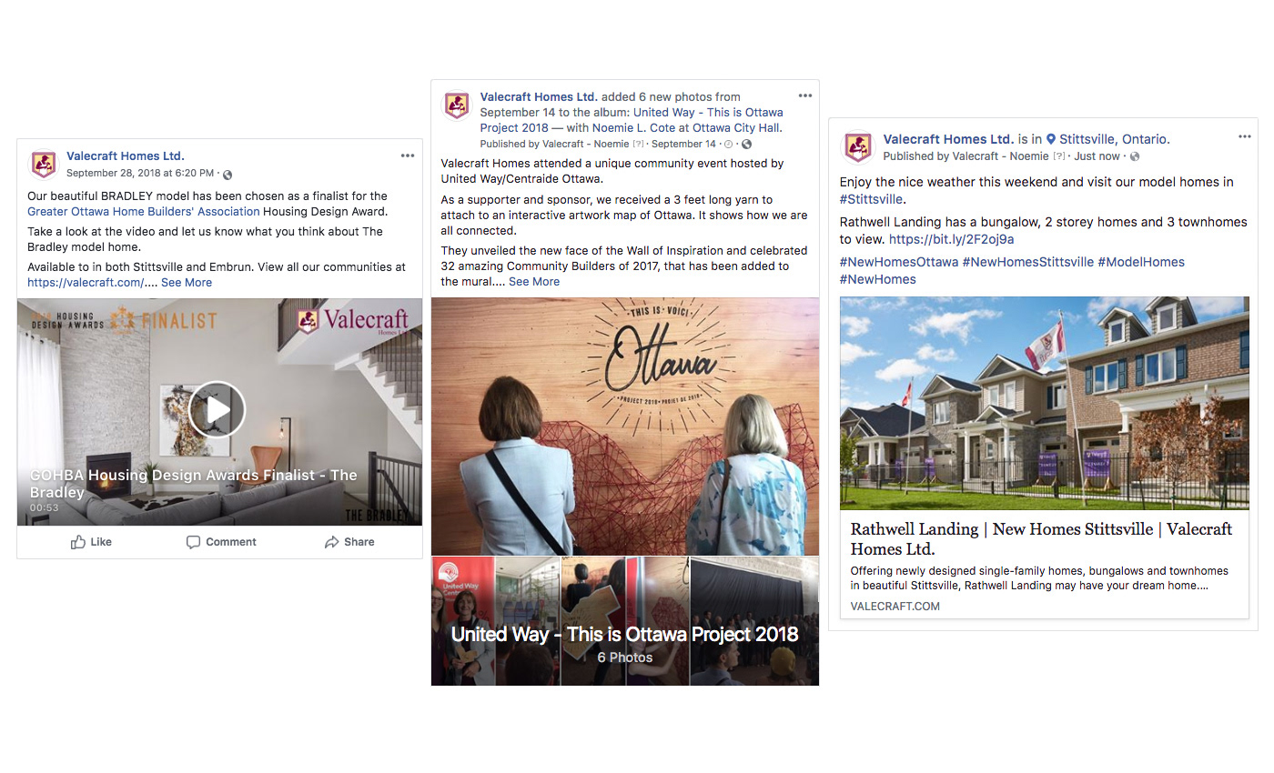
VALECRAFT HOMES
Ottawa New Home Builder
COMMUNICATION OBJECTIVES
Create a corporate brand identity, brand image and voice for a new home community in Stittsville that:
• evokes the feelings; of happiness, safety, luxuries, and belonging within a community
• represents the product and values of the home builder
• evokes the feelings; of happiness, safety, luxuries, and belonging within a community
• represents the product and values of the home builder
BRANDING
To create the desired experience and perception of Rathwell Landing, a thorough review of target audiences, competitors, and the community was performed to create a unique look.
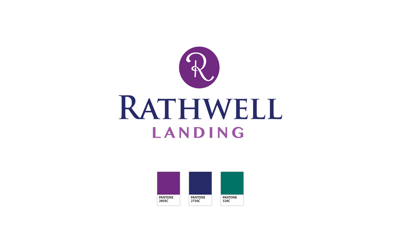
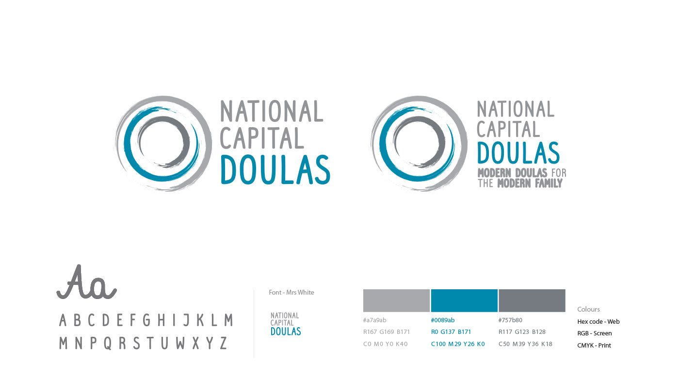
The chosen fonts represent the transitional style of our homes, a mix between traditional and contemporary that appeals to a wide range of demographics. The bold and small caps serif font used for RATHWELL embodies the history of the Rathwell family crest and the community which was once called Rathwell Corners.
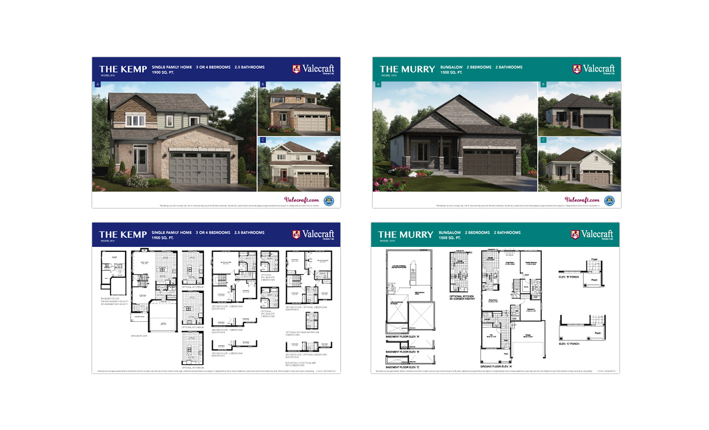
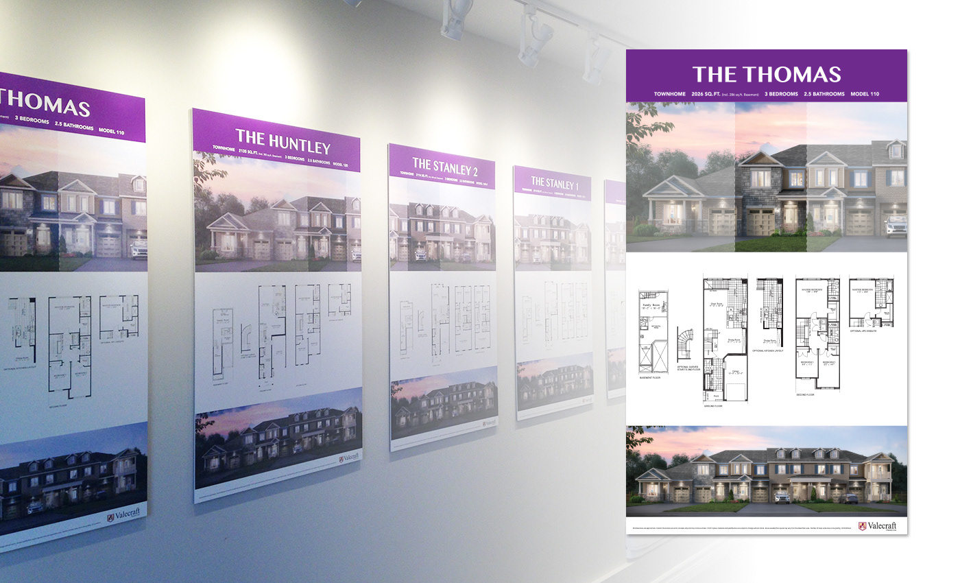
The icon is a modern and subliminal ‘official stamped seal', adding visual interest and a sense of genuineness. The distinctive jewel tones were inspired by the ultra violet Pantone colour of the year, and the sense of tradition. They are strong on their own while cohesive with Valecraft Homes' visual brand. The Rathwell Landing brand colours not only were used throughout print and digital marketing campaigns for consistency and recognizability, but they also helped the viewer differentiate between model types and lot sizes.
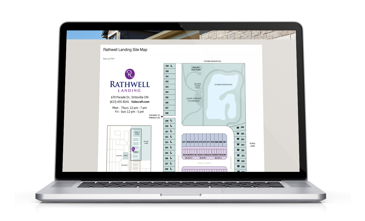
You will find the consistent visual brand throughout the Valecraft website, marketing, brochures, sales center signage, and street signage. The overall unique visual brand of Rathwell Landing stands out amongst its competition, it's memorable, and leaves a sense of approachable luxury and heritage.
In addition, worked with service providers to; develop the tone of voice for written content, 3D renderings, and directed photoshoots.