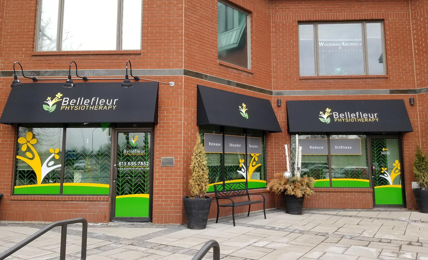
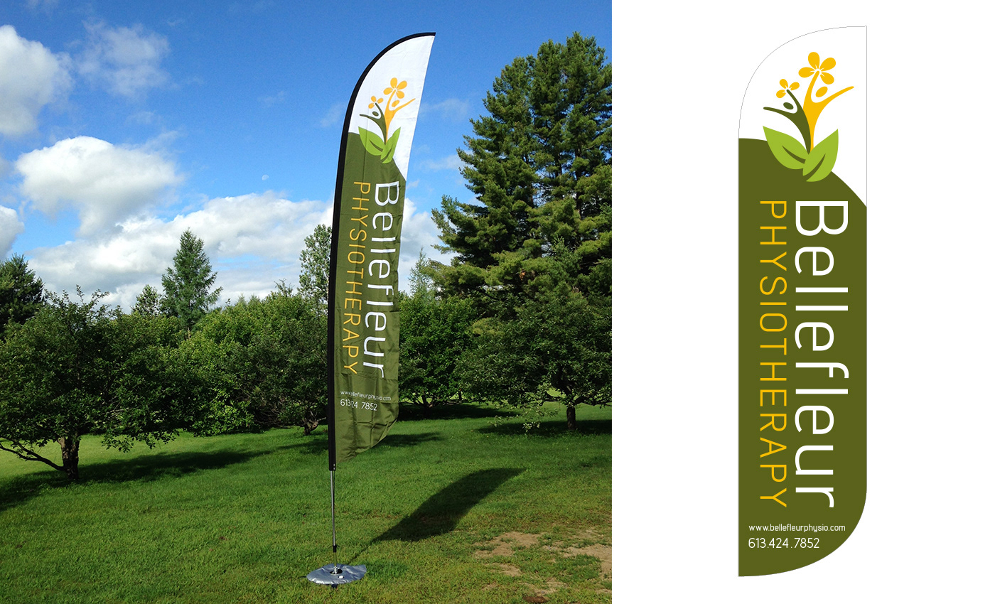
BELLEFLEUR PHYSIOTHERAPY
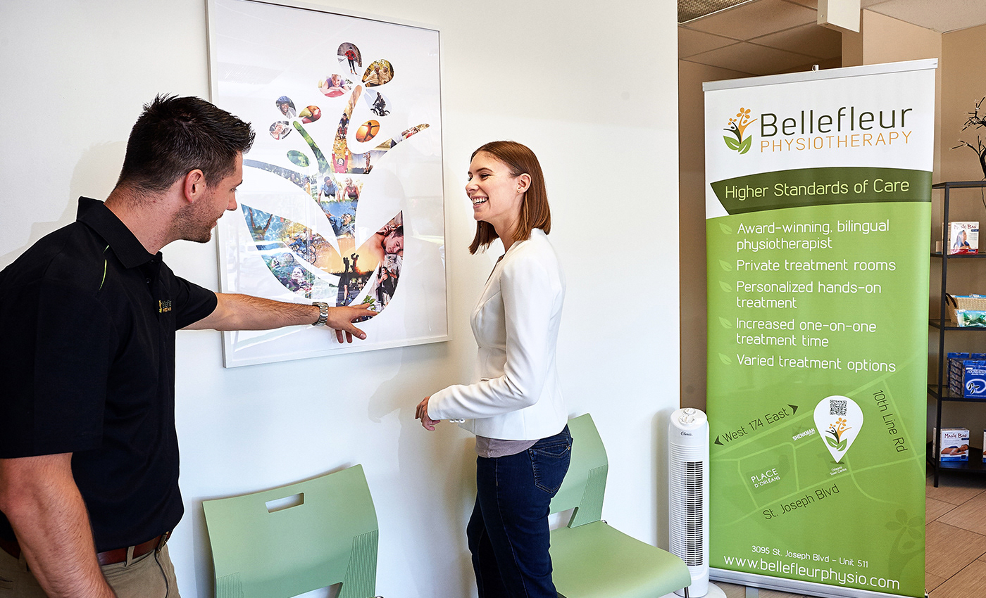
The award winning Bellefleur Physiotherapy team focuses on the quality of care, and exceptional customer experience. Their brand is friendly, approachable and empowering. www.bellefleurphysio.com
COMMUNICATION OBJECTIVES
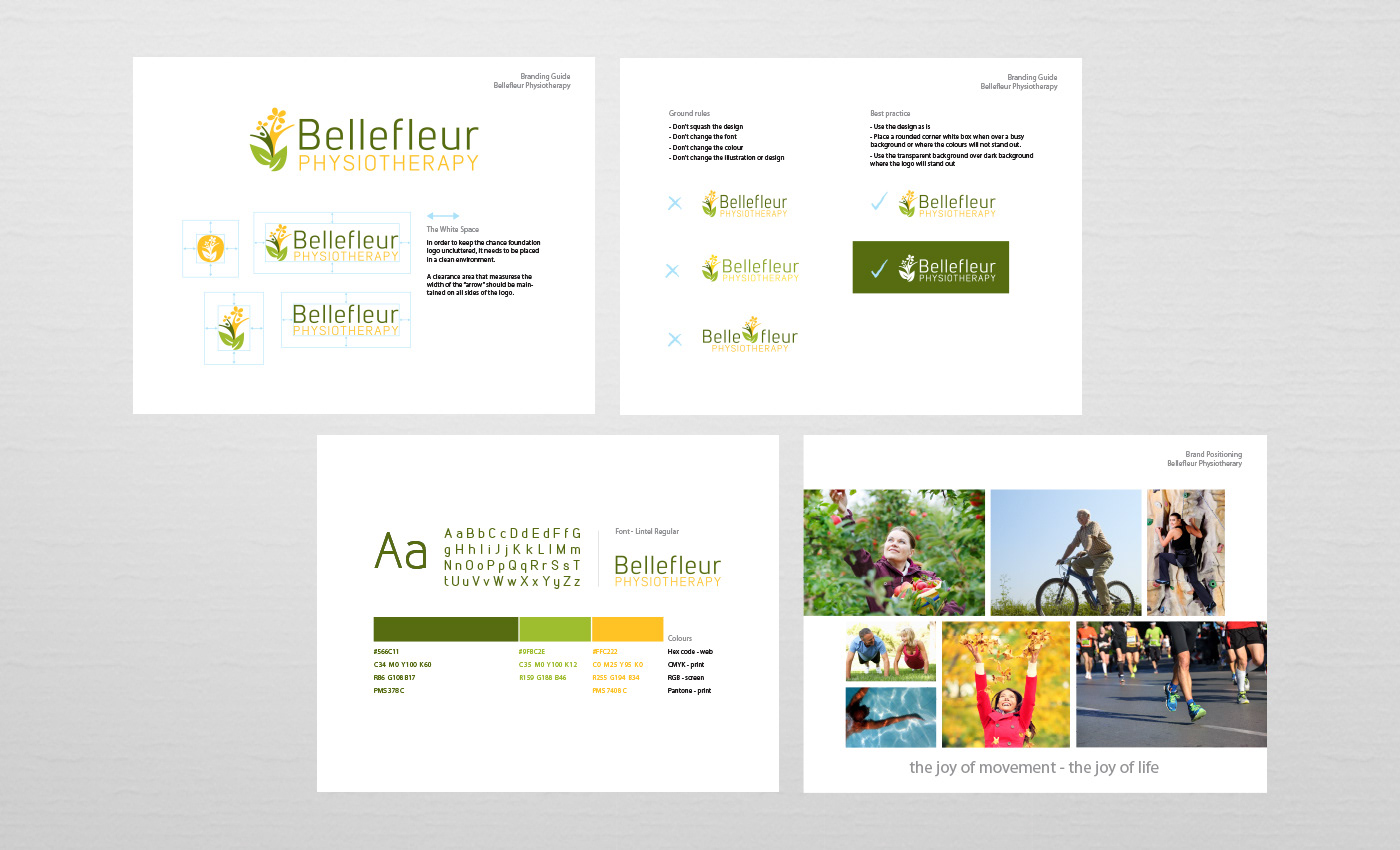
Create a corporate brand identity and cohesive brand image that:
• represents enjoyment of life through movement
• colour palette that is fresh with vitality, yet calming
• friendly and approachable
• represents enjoyment of life through movement
• colour palette that is fresh with vitality, yet calming
• friendly and approachable
BRANDING
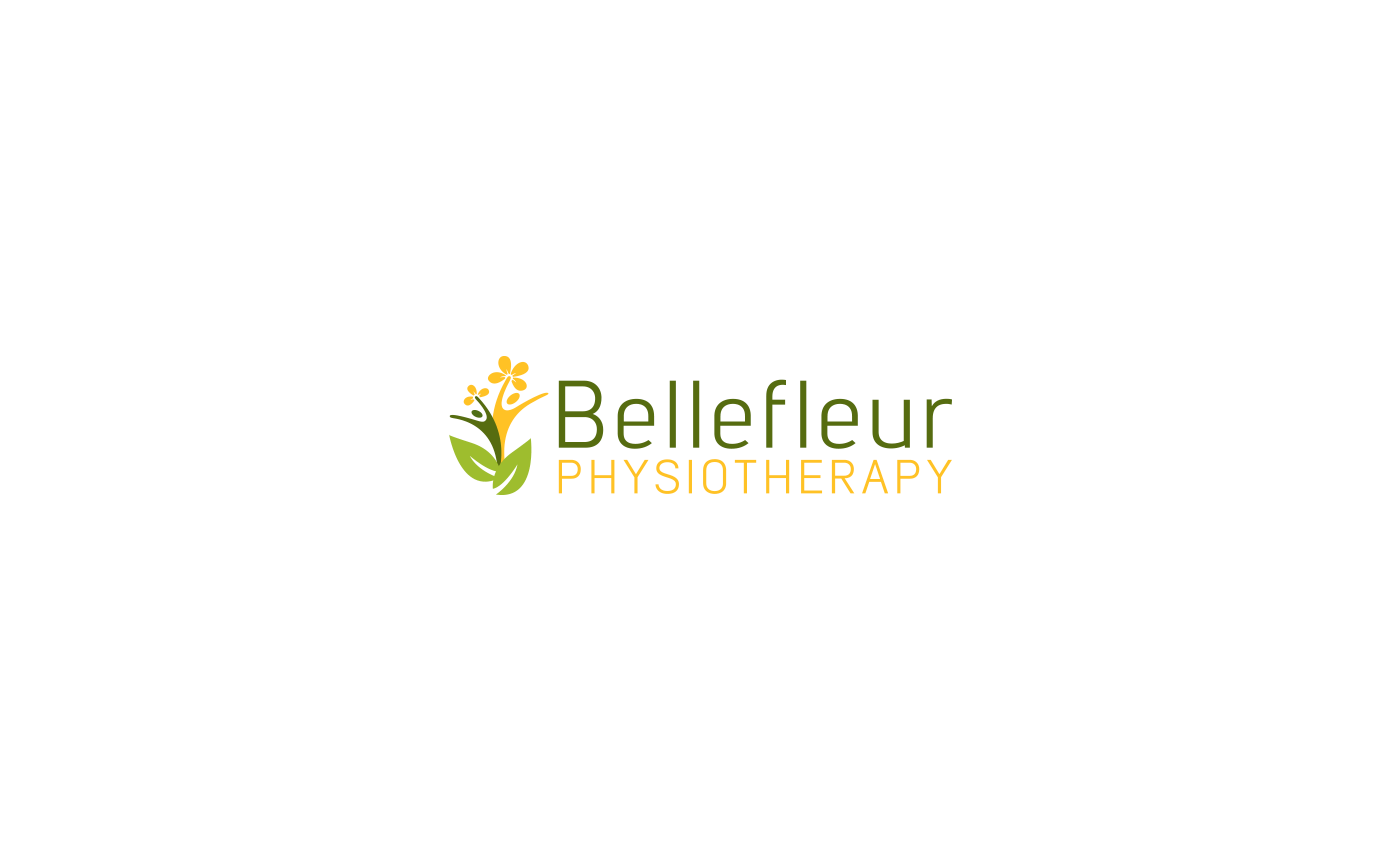
Created a new corporate identity and marketing materials that represents movement/mobility, the name itself Bellefleur means beautiful flower in french. The icon represents the flower, joy of movement, growth and family/community. The font is approachable with structure. The colour palette represents the greens of nature and yellow for energy.
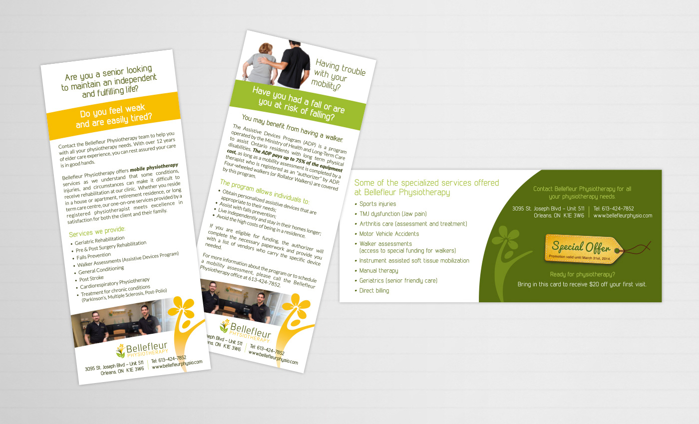
The branding guide was applied for their practice when choosing interior colours, window imagery and designing wall art.